Yến Sào Quang Minh launches new brand identity — The feng shui story behind the Logo
After a period of development, Yến Sào Quang Minh officially launched a new brand identity — marking a transformation in its journey to assert its position in the Vietnamese bird's nest market. Not merely a change in appearance, the new logo also conveys carefully chosen feng shui values, carrying expectations of smooth operations and prosperity for the company.
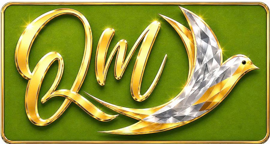
The new logo takes the stylized swiftlets as its centerpiece — the wings are crafted from hundreds of multi-faceted diamonds, sparkling with silver mixed with gold, blending with the body and the handwritten, gracefully curved "QM" letters, in solid gold. The entire image is set on a dark green velvet background, surrounded by an intricate gold frame — creating a whole that is both luxurious and familiar, reminiscent of the swiftlets wing image associated with the brand.
What can be seen on the Logo
- Stylized swiftlets at the center: the brand's most familiar image, helping viewers immediately associate it with bird's nest products.
- Polygonal wing panels: the alternating light and dark panels create a sparkling diamond-like effect, emphasizing sophistication.
- Handwritten "QM" in gold leaf: the first two letters of "Quang Minh", with soft and continuous strokes, blending into the bird's body.
- Dark green velvet background and gold frame: highlight the golden parts of the letters and the bird image while creating a warm, approachable feeling.
The diamond gold color — a symbol of nobility
The first noticeable highlight of the new logo is the diamond-like gold color standing out against the green background. In feng shui conceptions, this sparkling gold symbolizes nobility, elegance, and good fortune — while also initiating the cycle of mutual generation in the Five Elements: Water generates Wood.
The green color — Wood generates Fire, continuing the cycle of mutual generation.
Alongside the golden color, the green background covers the entire Logo representing the Wood element — a symbol of growth and sustainable development. According to the cycle of mutual generation, Wood gives rise to Fire, continuing the flow of positive energy, forming an unbroken cycle of Water generates Wood — Wood generates Fire, symbolizing continuous development in harmony with the natural order of the earth and sky.
Why choose the swiftlets symbol?
For a bird's nest brand, the swiftlet is both the origin of the product and the most memorable image. Stylizing the wings in an upward direction evokes a sense of movement and a new beginning. At the same time, the bird shape and the letters 'QM' are connected into a single block, making the logo easily recognizable even when printed small on labels or reduced on a phone screen.
Read quickly the cycle of mutually generating elements in the Five Phases.
To understand how the brand interprets colors, you can remember the basic cycle of mutual generation, which consists of five steps: Metal generates Water, Water generates Wood, Wood generates Fire, Fire generates Earth, Earth generates Metal. In this logo, the brand focuses on the segment "Water generates Wood — Wood generates Fire." It should be noted that assigning colors to each element can be understood in different ways by different schools; this article presents the interpretation according to the brand. You can read more in the article Mutual generation of the Five Elements in brand design.
Compatible with the owner's element and age
Not only does it carry the mutual support significance in terms of the Five Elements, the color palette of the new logo was also chosen based on the age compatibility of the founding family members, including the father, mother, and son. The harmonious combination of mutually supportive colors is expected to bring prosperity, favor business activities, and strengthen the bond of the entire family.
Where is the logo used?
The visual identity has multiple versions for different purposes. The full version on a green background is used for main publications. The simplified version, separated from the background frame (just keeping the letters "QM" and the swift bird), is convenient for packaging, business cards, and various other materials. Besides these two diamond versions, the brand currently also uses a red — yellow version on its website and price lists. Some old product images may still have the previous logo and will be gradually replaced.
Note: Feng Shui and the Five Elements are traditional cultural concepts, used by the brand as a design inspiration. They are not a scientific basis to guarantee business results or product quality. Bird's nest is a food, not medicine.
With the new brand identity, Yến Sào Quang Minh wishes to convey a beginning full of positive energy — continuing the mission of bringing valuable nutrients from natural bird's nests, accompanying the health of every Vietnamese family.